Square or Rounded Housing? A Designer’s Guide to Matching Rainier Power Screens to Your Home’s Architecture
If you’ve spent any time on our site looking at motorized retractable screens, you already know we install Rainier products. What the spec sheet doesn’t tell you is that the housing — the box at the top that holds the rolled-up fabric — changes how the whole system reads on your house. Square or rounded. Most homeowners don’t realize it matters until the installer is on site and asks which one they want.
We’ve installed both housings on hundreds of Seattle, Bellevue, and Mercer Island homes over the last eight years. After a while you start noticing patterns. Certain housings just look right on certain houses. Others fight the architecture in a way you can’t quite name until you’re standing across the driveway squinting at it.
This is a quick field guide to picking the right one before the truck shows up.
What you’re actually choosing between
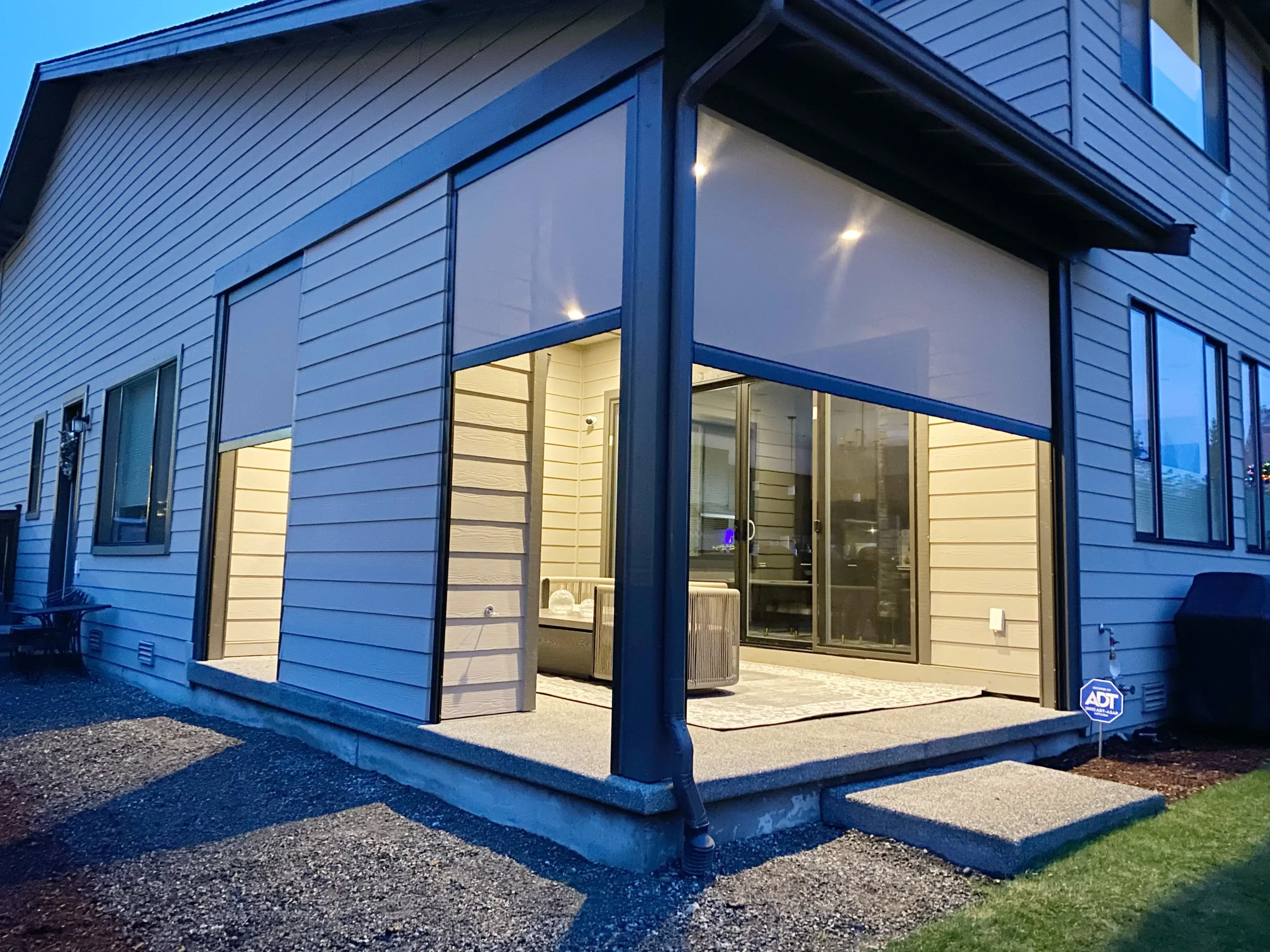
Rainier offers two power screen housings. The traditional rounded design is the one we install most often. It has a soft profile that reads almost like a gutter or a fascia trim from a distance. The newer square housing has clean 90-degree edges and sits flush against the wall like a piece of architectural hardware.
Both come in 16 standard powder-coated colors. Both house the same motors and fabrics. Both carry the same warranties. The only thing that changes is the silhouette, and the silhouette is what your eye locks onto first.
The square housing belongs on modern and contemporary homes
If your house has flat roof lines, large rectangular windows, board-and-batten or smooth stucco siding, or any of the design language that came out of the post-2010 Pacific Northwest modern movement, the square housing is the right call. It echoes the geometry that’s already there. A rounded box on a sharp-cornered house looks like a contractor add-on. The square box looks like it came with the building.
We see this a lot in newer Bellevue and Sammamish builds. Big sliders opening onto a deck, cedar soffits, dark window frames. Drop a square Rainier housing in matte black or charcoal above the slider and it disappears into the trim package. People assume it was speced by the architect.
The square housing also works on commercial-adjacent residential. DADUs with metal accents, garage conversions, modern ADUs. Anywhere the design vocabulary is already industrial or precise.
The rounded housing belongs on traditional and transitional homes
Most of the homes we work on around Seattle, Mercer Island, and Kirkland fall in this category. Craftsman bungalows. Cape Cod revivals. Northwest contemporary with cedar shingles and exposed beams. The rounded housing reads as architectural rather than mechanical, which is what you want when the rest of the house is built from softer shapes.
There’s a practical reason too. On older homes the trim, fascia, and gutters often have curved or beveled profiles. A square housing next to a curved gutter looks like two different products bolted together. The rounded housing visually rhymes with what’s already there.
If you’re adding a screen to a covered deck or a louvered pergola, the rounded housing also tends to integrate better with the pergola’s own beams and posts. The transition feels intentional instead of stacked.
Color matters as much as shape, sometimes more
Color choice is where most homeowners go wrong, not housing choice. The 16-color palette gives you room to either hide the housing or feature it, and people default to white without thinking about whether their house wants white.
A few rules I keep coming back to.
Match the housing to your trim color, not your siding color. If the trim is bronze, the housing should be bronze. The eye reads housings as part of the trim system, not part of the wall.
If your home has dark window frames, go dark on the housing. A white housing above a black-framed window draws attention to the screen, which is the opposite of what you want.
For homes with mixed materials, like stone wainscoting and lap siding above, pick the color that matches the upper material. That’s where the housing actually lives.
Custom colors are available for an upcharge. We’ve done a few in specific Sherwin-Williams and Benjamin Moore matches when the homeowner had a very particular trim color. Worth it for the right project.
How I actually think about it on site
Most of the time I don’t run a checklist. I look at the roof line first, because that sets the architectural tone for everything below it. Hipped roofs with traditional eaves usually want rounded. Flat or shed roofs usually want square.
Then I look at the window frames. Divided lights and mullions point toward rounded. Big floor-to-ceiling sliders point toward square.
The third thing I check is almost always the front door hardware. Sounds weird, but it tells you what the architect or builder was going for. Brushed nickel levers and rectangular escutcheons say square. Oil-rubbed bronze knobs with curved backplates say rounded.
When the house gives mixed signals, the rounded housing is the safer default. It disappears more often than it stands out, and on a Seattle home that’s usually what you want.
Where the screens go also affects the decision
A housing that lives 20 feet up under a high gable reads differently than one mounted at deck height where you walk past it every day. For high mounts, shape matters less because nobody sees it up close. For low mounts on patio doors, ground-floor windows, or deck enclosures, shape and color both matter a lot.
This is also why we ask people whether they’re enclosing an outdoor room or just shading a window. An enclosed outdoor room with screens on three sides becomes its own architectural element, and the housings need to be treated as such. A single screen over a kitchen window is more like trim work, and you want it to vanish.
What we recommend doing before you order
Take a photo of your house from the street. Print it out. Hold it at arm’s length and squint. The features that still read clearly when blurred, like the roof line, the trim color, the dominant window shapes, are the ones the housing has to harmonize with. Anything that disappears at that distance doesn’t matter for this decision.
Then look at the Rainier color samples in person, ideally in daylight on the wall where the housing will live. Powder-coat colors shift surprisingly under different light conditions. The bronze that looks warm in our showroom can read almost black in late-afternoon Seattle light against north-facing siding.
If you want a second opinion, that’s what the free quote consultation is for. We’ll bring physical samples, hold them up against your trim, and tell you honestly which housing is going to age well on your specific house. Sometimes the answer isn’t the one you came in expecting.
The screens themselves are an investment. Spending five extra minutes on the housing decision is worth it.